Feedback UI
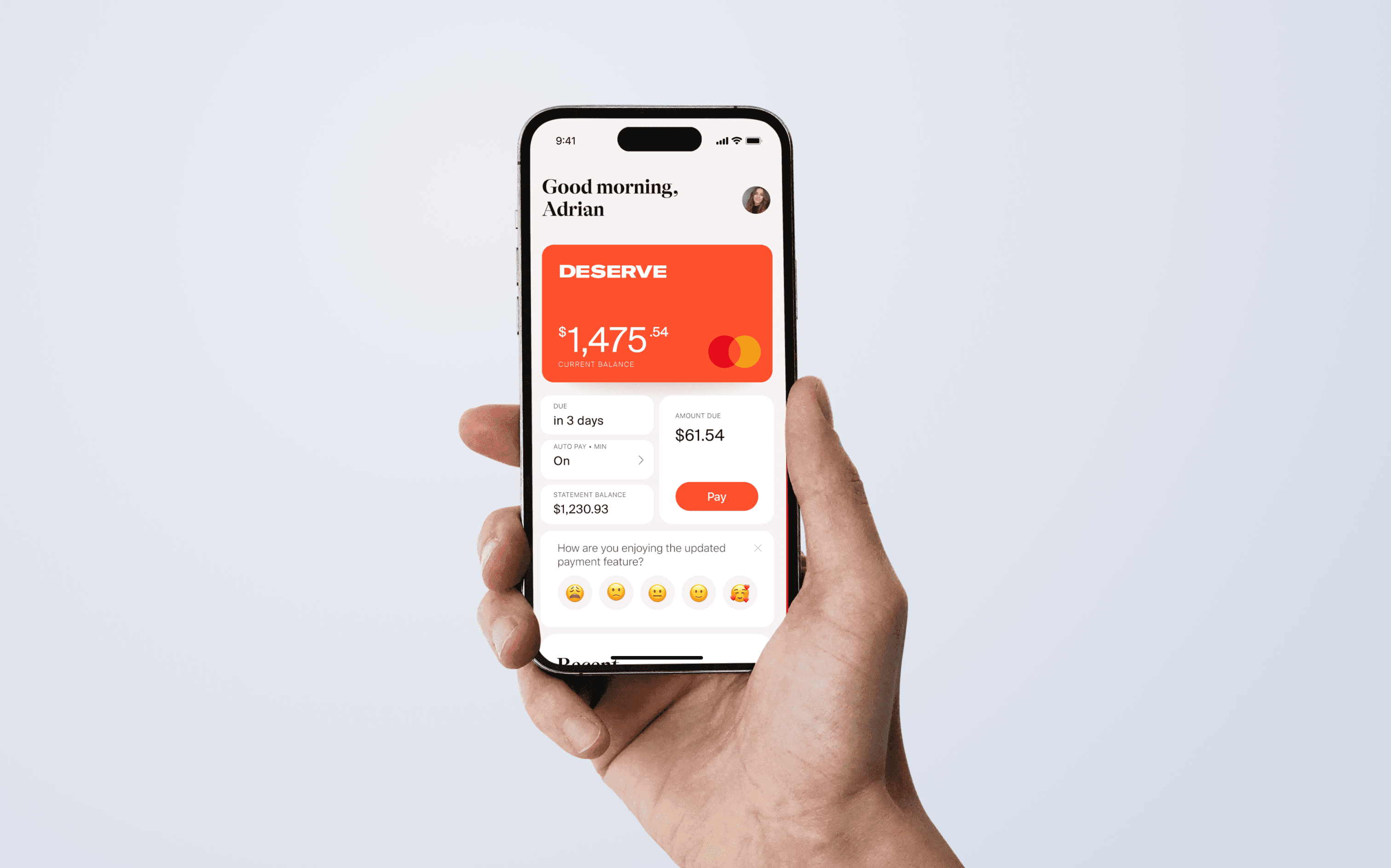
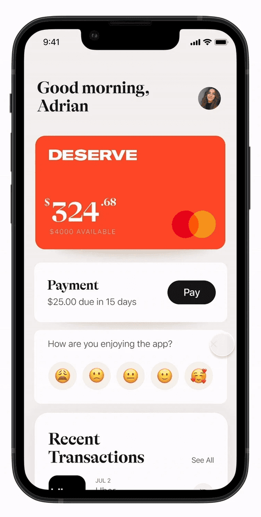
Feedback modules in the Deserve App to gain insights into our clients' challenges and identify opportunities for app improvements.
I worked with the design team for this project and collaborated with the engineers to incorporate this to our app. I specifically helped with the feedback gathering and making of the feedback ui.
Due to NDA only certain parts of this project are shown
UI/UX Design
UI/UX Design
UI/UX Design
UI/UX Design
Interaction Design
Interaction Design
Interaction Design
Interaction Design
Design System
Design System
Design System
Design System
Design Strategy
Design Strategy
Design Strategy
Design Strategy

How can we easily define user pain points in our app?
How can we easily define user pain points in our app?


Identifying the Problem
The goal for this project was to increase our app’s rating on the App Store. In order to do this, the design team gathered and sorted every single review left on the app to see what users liked and disliked on the app.
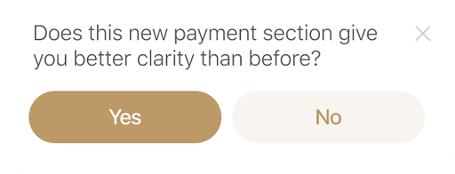
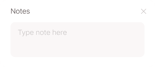
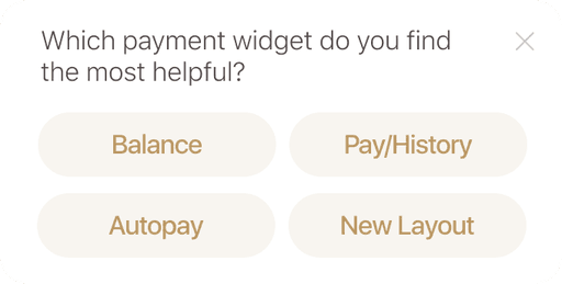
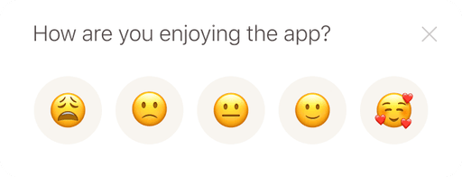
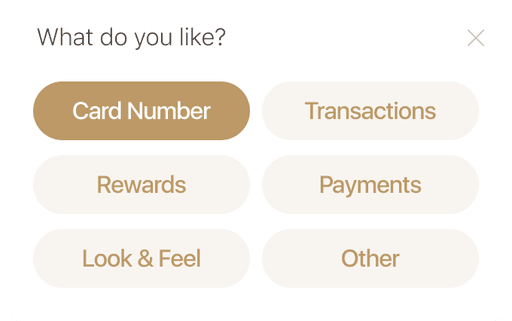
Additionally, I created simple popups within the app to gain further insight on which features the users liked and disliked.


What we discovered
Main pain points identified from reviews and feedback
Main pain points identified from reviews and feedback
Main pain points identified from reviews and feedback
Login
Login
Login
Login
issues with verification steps and occasional errors appearing in onboarding flow
issues with verification steps and occasional errors appearing in onboarding flow
issues with verification steps and occasional errors appearing in onboarding flow
Payment
Payment
Payment
Payment
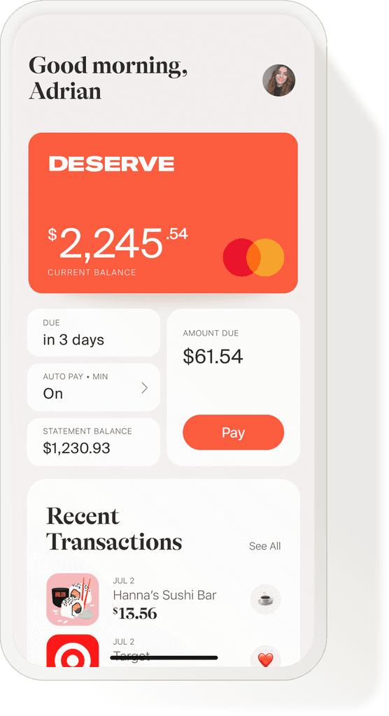
confusion in payments due to insufficient information and clarity
confusion in payments due to insufficient information and clarity
confusion in payments due to insufficient information and clarity
Technical
Technical
Technical
Technical
bugs in certain parts of app
bugs in certain parts of app
bugs in certain parts of app
Customer Service
Customer Service
Customer Service
Customer Service
support was unsatisfactory
support was unsatisfactory
support was unsatisfactory
Narrowing Down
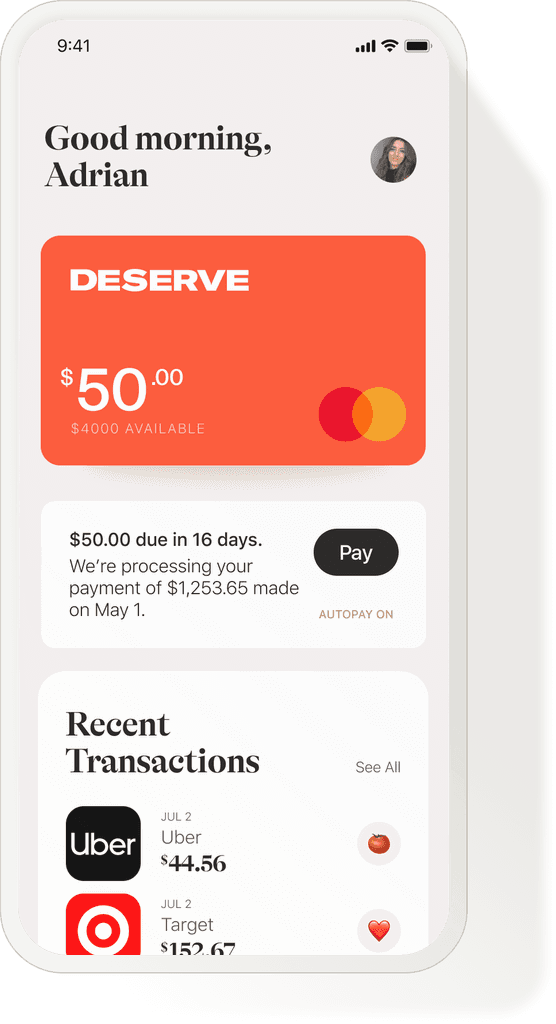
We decided to focus on the main section that people complained about, the payment. This way the design team could efficiently work and update sections at a time. After a quick sprint, the payment section was redesigned with clarity at the focal point.
We decided to focus on the main section that people complained about, the payment. This way the design team could efficiently work and update sections at a time. After a quick sprint, the payment section was redesigned with clarity at the focal point.
We decided to focus on the main section that people complained about, the payment. This way the design team could efficiently work and update sections at a time. After a quick sprint, the payment section was redesigned with clarity at the focal point.
Old Design
Old Design


New Design
New Design


How did we do?
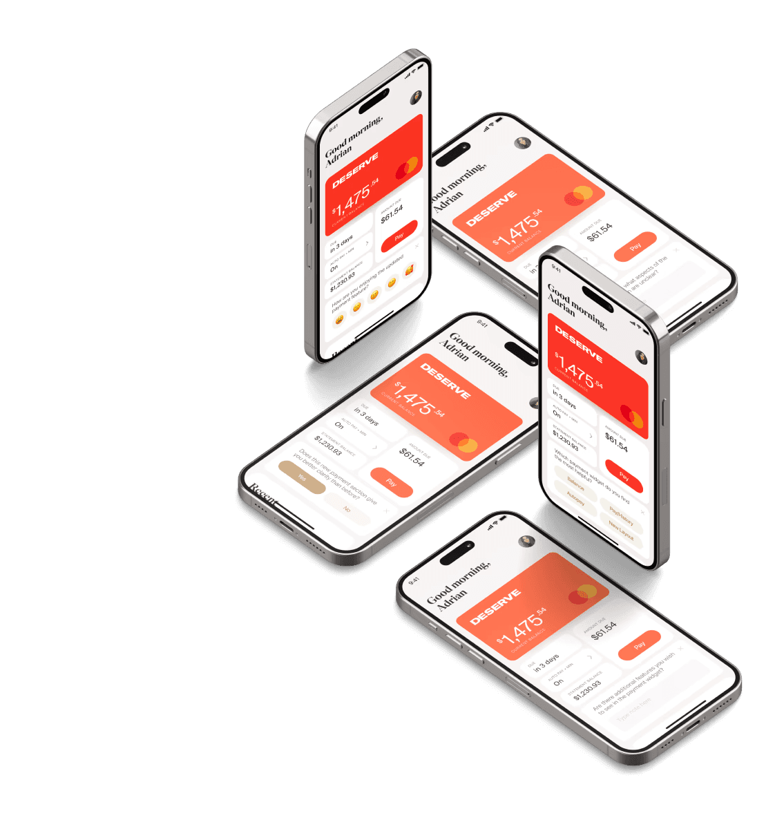
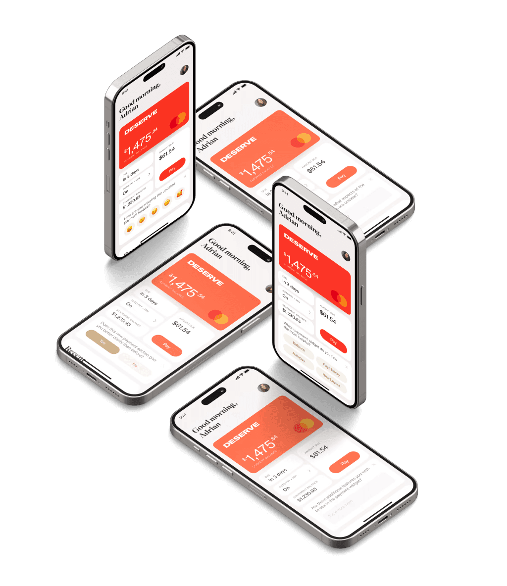
With this new payment feature, additional feedback modules were created to see if the new design met the user’s concerns. We also created a new email to send out users that had previously written reviews and asked for them to give an updated review on the new designs.
Based off the feedback, the design team would decided whether or not another sprint was required to further improve the payment feature.
The Impact
Due to time constraints at the time, updating the payment feature was the last change we could make for the time being. However, it was rewarding to see that the existing users had reacted positively to the change. We were able to see an increase
Due to time constraints at the time, updating the payment feature was the last change we could make for the time being. However, it was rewarding to see that the existing users had reacted positively to the change. We were able to see an increase
Due to time constraints at the time, updating the payment feature was the last change we could make for the time being. However, it was rewarding to see that the existing users had reacted positively to the change. We were able to see an increase
24%
24%
24%
rating increase
rating increase
rating increase
38%
38%
38%
positive user reviews for payments
positive user reviews for payments
positive user reviews for payments
71%
71%
71%
payment complaints the next month
payment complaints the next month
payment complaints the next month
Lessons Learned
Due to time constraints, we were only able to focus on one feature for this update. However, even with these limited changes, we were able to observe a positive impact on our users.
Going forward, I plan to schedule regular check-ins with our app and have quick sprints with the team to implement updates. This approach will help us stay responsive to user feedback and demonstrate our commitment to continually improving the app experience.
Anne Portfolio 2024
Anne Portfolio 2024
Anne Portfolio 2024


